

ROOF Group
Website Consultation
Client: Helsinking
Role: UX Consultation
The Challenge
Helsinking had worked on a website for a new real estate company, ROOF Group. Around the time of launch, I offered to examine the website and consult them on how it could still be improved from a UX perspective. It was important to focus on the smaller details and key interactions within the site, rather than the big picture as a whole, because the overall structure and form of the site had already been established.
The Process
I kicked off the process by browsing through the website with specific goals and tasks in mind. These tasks included for example:
- Finding out more information about the company and the people who work there.
- Searching for property listings, with various requirements (price, location, size, etc.)
- Finding specific bits of information about a property (e.g when it was built)
- Contacting the company.
After each test, I noted down my thoughts, focusing on any issues and challenges that arose. From there, I began developing solutions to the identified problems. This involved analysis of key competitors’ websites. Based on the competitor review and my own experiences with the website, I drew up a list of suggestions that could be utilized to improve the site.
The Outcome
The given suggestions included the following:
Listing search
- When typing in the location a user wants to search for, it was unclear what exactly should be written. The input field did have a somewhat helpful placeholder, but whether specific areas of a certain city are valid search terms is uncertain. In addition, a user is required to type in the whole term. Implementing realtime search suggestions would remedy both issues.
- Instead of using two separate input fields for setting the price range of searched listings, having a slider with nodes on both ends would be a more efficient and intuitive solution, especially on mobile devices.
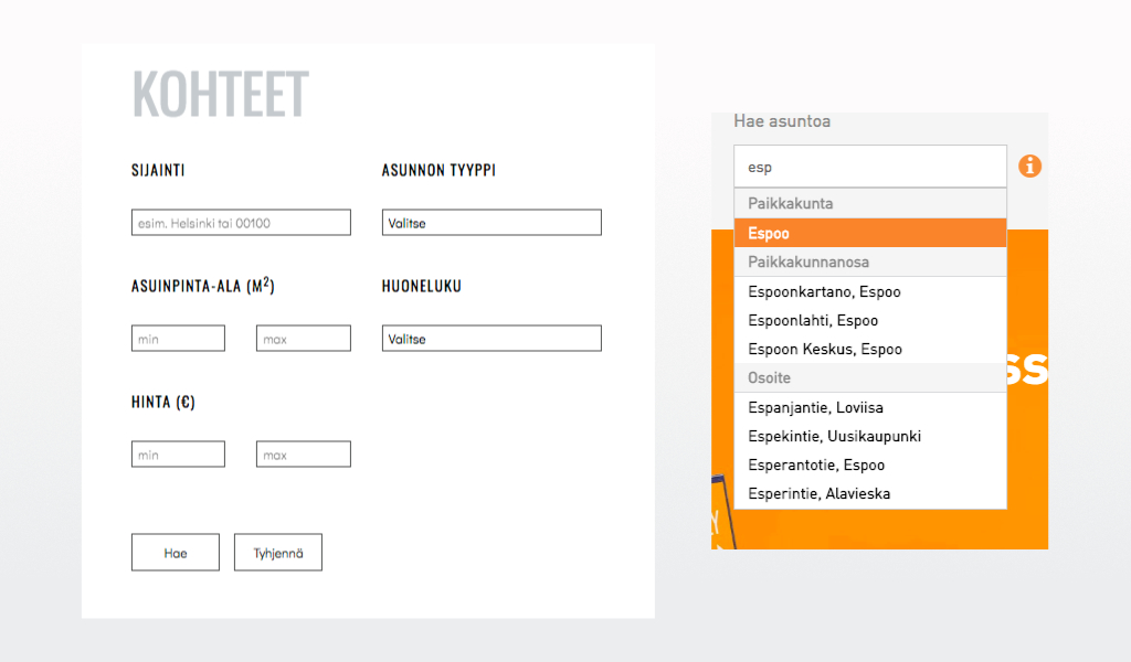
ROOF Group search form on the left. Competitor's search form with realtime search suggestions on the right.
Listing page
- All the information about a property was packed into a small window within the webpage and listed in one long list. Finding specific bits of information was challenging. Sorting the information into logical subcategories would be helpful.
- The arrows used to switch between images were very thin and similar in color to the floor plan images. This made it difficult to notice them to begin with. A background behind the arrow would make them more visible to users.
- Having an embedded map of where the property is located would be helpful. Now a user is forced to copy-paste the address to an external map service.

All information about the property in one long scrollable list.

Competitor's website with information divided into segments.
Contact form
- The form fields had no actual labels, only placeholder texts that were used as labels. This meant that once a user starts typing, the label disappears, making later edits to the filled information more challenging. Adding actual labels that are permanent, or alternatively something along the lines of float labels, would make the form less ambiguous.
Some of these suggestions were implemented on the ROOF Group website, while other have yet to be applied.